Archived forum. This is a read-only copy of the Smart Keyboard community forum (2010–2015), kept for its history and its skins. Posts are shown as they were written, so some answers are out of date — see Help for current information. Want a post of yours removed? Email contact@smartkeyboardpro.com.
Minimalist Skin Idea to Improve Typing Efficiency
andyk
great work on the keyboard.
couple thoughts on the skins you have available. i actually find it more difficult to type when the numbers and letters are both visible on the keys. when i am typing quickly, i often make errors because of so many visual distractions. may i suggest a couple things to try:
1. Add an option to turn off the 'shift' functions visible on the keys, or reduce their contrast so they are less visually prominent.
2. Consider adding a skin that is super minimalist. no button outlines, just the letters. as i read another portion of this forum, the iphone keyboard seems to have smaller buttons, which forces the typist to be more accurate. what if you tried removing the buttons boundaries altogether. using the android color scheme, use a dark grey background with nice bright crisp letters. I think it may work.
Thanks for listening!
Andy
andyk
another thought...
smart keyboard pro's virtual keyboard default android skin has the letters shifted down on each key's button (about the distance of half the letters height) in order to make room for the small "shift" text on each key.
because the letters are lower on each key, the typist could be targeting the center of the letter, and not the center of the button. this could cause hit-area errors.
many users have complained about the hard keyboard on the motorola droid. this same idea could be a culprit. the actual button for each key on the hard keyboard is not actually located beneath the letter... its located beneath the center of the button. since the buttons don't have clearly defined boundaries, typists aim for the letter, and thereby miss the actual button by just about a letters-width. repeating those keystrikes over and over accounts for compounding errors.
I suggest giving my "minimalist" skin a shot, and placing the center of the hit-are directly beneath the center of each letter, not the button it's on.
andyk
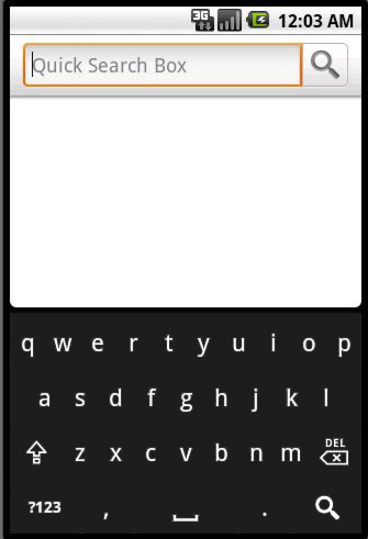
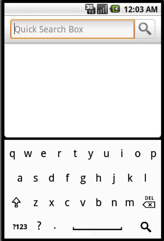
here is an quick mockup. it may be good to keep button boundaries around spacebar and others, depending.
Attachments
minimal mockup.jpg
andyk
another mockup
Attachments
mockup3.jpg
cyrilDeveloper
Hi this skin may be an idea (quite simple to do actually), however: - I'm implementing solution 1 - In fact there is already a vertical correction of the hit point, to take into account the fact the thumb doesn't press the screen exactly where you think it will, but a few pixels below. As everybody doesn't have the same fingers, the only generic solution is to implement key calibration as HTC IME does. I may add it some day but that's not the priority
andyk
cool,
thanks for considering the suggestions.
i used the iphone skin for a few days but had to switch back mainly because i would find myself searching for letters with all of the visual lines and additional text on each key. i took a visual design class in college that explained how your eye will isolate the region of your vision with the most contrast. (in movement or tone). the minimalist skin would be fun to try when you get time. i feel it would be quite effective.
thanks. btw, great work. the autotext feature is fantastic.
andyk
self-fulfilling prophecy
Attachments
mockup4.jpg
nick.koutrelakos
also, has anyone used the HTC-IME keyboard ported to the Droid (so far in portrait mode only)? First, I just want to say this has the best auto-correction out of any keyboard i've ever used. but, to stay on topic, it has a calibration tool where you type "The quick brown fox jumps over a lazy dog" and from where you touch each letter, it sets up personal calibration so you type with more accuracy all the time. If you, Cyril, could incorporate something such as this, i think it'd be a huge improvement of what is already the best keyboard app on the Market.
cyrilDeveloper
Hello I have a HTC Hero so I know well the HTC keyboard This was already discussed somewhere else and this is a bit of work, but it's in the TODO list !
cyrilDeveloper
andyk wrote:self-fulfilling prophecy
So if I had to add this skin, should it be black, or white ?
andyk
haha, awesome.
well from an advertising class i took in school, it was taught that it is easier to read copy that is black on white, rather than inverted or outlined.
my vote would be for white, even though android chose to go inverted.
andyk
cyril!
alright, the skin is awesome.
i must admit, it was tough to wrap my mind around it when i first started using it, because it seems like its missing something. but once you get the hang of it, it really does force you to zero in on the key you are trying to press. i'm liking it a lot.
i'm interested to see what kind of reception it gets before its further developed, but i have a couple thoughts....
1. add a black line along the top of the keyboard between it and the suggestion bar, same weight (thickness) as the letters. it'll make it look more finished.
2. it may help to expand (widen) the symbol for the spacebar... looks empty down there.
3. it would be cool to have some visual feedback like a water ripple or a glow around each letter as you hit it. i know that would probably take forever to do, but its fun to think big.
that's enough out of me. great work.
avatar5d
Yeah, I'm digging it as well. Any chance we can also get a white-on-black skin?
drachp
avatar5d wrote:Yeah, I'm digging it as well. Any chance we can also get a white-on-black skin?
Another vote for white-on-black skin. Also, is there a chance to have a skin like HTC IME (Htc Hero)?