Archived forum. This is a read-only copy of the Smart Keyboard community forum (2010–2015), kept for its history and its skins. Posts are shown as they were written, so some answers are out of date — see Help for current information. Want a post of yours removed? Email contact@smartkeyboardpro.com.

Compact Keyboard

boowalley
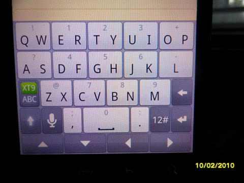
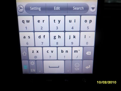
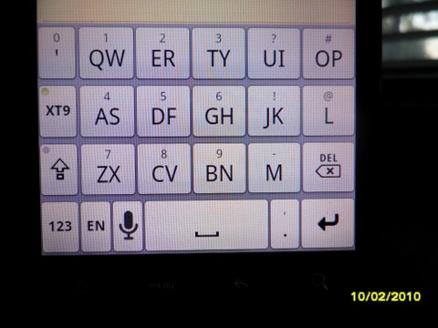
It would be nice if you could make the compact keyboard layout keys cover the entire screen like the htc and touchpal keyboards. That key on the left really could be moved so that the keys that we actually use wouldn't feel so cramped. I alternate between your keyboard and the other 2 but I wouldn't need them if the compact keyboard was as big as the others. Just one man's opinion. Thanks.

Theo Smith
BozQ
Make that two!
Would be nice to see the same thing with T9. It could really use the extra room on the left and right.
cyril Developer
Is it what is asked here?
There are keys on the left on the HTC IME compact layout... or maybe you are talking about another keyboard, can you show me?
boowalley
Pics of what I'm referring to.

Attachments

SAM_0120.JPG
SAM_0120.JPG
SAM_0119.JPG
SAM_0119.JPG
SAM_0118.JPG
SAM_0118.JPG
Sally Mack
Pretty much the same thing mentioned in the other thread... to make the kb more symmetrical by removing or moving the xt9 key. I love the touchpal layout, but smart keyboard is much more responsive :).
boowalley
You're right, it is pretty much the same as the other thread but the problem I have is not the X9 key it's the upper key on the left. If that key were removed that top row could be expanded so that the compact keyboard would feel less cramped when typing. It just don't feel normal after using the other keyboards input layouts. TouchPal was very good on my old WM phones but it has fallen off lately. These are just examples of a better compact layout in my opinion.
cyril Developer
Ok, it seems to be a trendy topic ;)
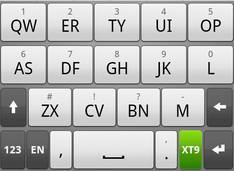
So, do you like this new layout?

You can test it in the latest beta version (for QWERTY only at the moment)

Attachments

device.png
device.png
Sally Mack
Testing out the new keyboard right now... so far, i like it!

The only glaring issue I see is that i could swear the buttons get shorter in length by each row you get closer to the bottom of the keyboard. I'm not sure if it's just my eyes playing tricks on me, but im pretty sure its the keyboard.

Also, i think it would make more sense for the keyboard to always have big buttons in this mode (currently hitting "123" brings up a regular keyboard layout with small buttons). In my opinion, it should function as follows:

Main keyboard--> secondary characters (long tap) are commonly used symbols (like @, _, -, etc)
hit "123" button- brings up regular t9 keypad (numbers 0-9), as well as symbols like +,-,/, for any extra buttons left,or as long tap characters
hit alt while in "123" mode--> brings up even more extended symbols

Thanks!
cyril Developer
Yes something could be done for the numbers as well...

About the key size, it's of course the same on the first and second row, but is *slightly* smaller (19% instead of 20%) on the third row, but this was on purpose to avoid reducing the shift and delete key too much. Is this really a problem? Otherwise I could reduce the "M" key
Sally Mack
One more thing i noticed with this keyboard...

Adding custom words can sometimes be a bit difficult. For example, I type one word that gets recognized, select it, then want to follow it up with another word (to make a compound word). The suggestion tool only underlines the second part of the word.

The desired functionality would be for it to recognize that even though I made my selection, there is no space, so it should underline the whole word until I'm done it.

Say I have a made up word: jerknose.

I type jerk, select it, but don't hit space. Then I type "nose" (which it accurately predicts). Although the prediction algorithm should only be predicting anything after "jerk", the whole word should be underlined for the total suggestion (that way I can long-tap it to add it to my custom dictionary).

I hope that made sense!
Sally Mack
cyril wrote:Yes something could be done for the numbers as well...

About the key size, it's of course the same on the first and second row, but is *slightly* smaller (19% instead of 20%) on the third row, but this was on purpose to avoid reducing the shift and delete key too much. Is this really a problem? Otherwise I could reduce the "M" key
It's not a problem, but cosmetically it just doesn't look right. For some reason, this keyboard doesn't "feel" as natural as touchpal. Though I think that might be chalked up to touchpal possibly having larger keys, so naturally it's a bit easier to use.

Is there any way to tighten up the gaps between rows to make up the difference in spacing? If not, i dont think reducing the M key will affect usage or optics too much.

Thanks again for listening!
cyril Developer
So I reduced the M key in the latest beta, you can see the difference (I prefer the previous version, personally...)
boowalley
:mrgreen: I Love this new layout. This is exactly what I meant. It feels more comfortable now and not crowded in by that useless left key. Cyril your're the best. Keep up the great work. Now I can delete the other keyboards because the SmartKeyboard Pro has better Voice recognition and word suggestion than the others. I think I'll use only HTC and Smartkeyboard Pro. Swiftkey for some reason slows you down, TouchPal is half-baked and Swype is a gimmick. Yah Hoo !!!! :lol:
boowalley
:?: Food for thought. On the row above the keys where you have the ! ? , @ _ you have a big 'ol empty space. That space could be used for something, something like moving the DEL key up there so that every time I hit the delete key I don't hit the "M" key. Or a launch button for the "123" function. Not just an empty space.Or even the Microphone Icon, ala "Google Search". I'm just sayin :D
Sally Mack
boowalley wrote::?: Food for thought. On the row above the keys where you have the ! ? , @ _ you have a big 'ol empty space. That space could be used for something, something like moving the DEL key up there so that every time I hit the delete key I don't hit the "M" key. Or a launch button for the "123" function. Not just an empty space.Or even the Microphone Icon, ala "Google Search". I'm just sayin :D
Good point here.... move the "123" button up top in the suggestion bar, drop the shift key down a row, and you can have full sized "m" and "del" keys.

Also, trying out the new beta with the smaller M key... doesn't feel much different than before, so I think either way works.
boowalley
I'm trying out and also keeping the "beta". Even though it's in "beta", I already like this layout beta than the other one :P
BozQ
Now this is good stuff. It will be totally awesome to see the same thing happening with the T9 layout too. Using the entire screen width for the keys if possible. Thank you Cyril for all your hard work.
mazz0310
I'm the one that started the other thread and i have to say thank you so much for listening to your customers and giving us what we asked. Although this will take some getting used to its what we asked for. I personally still like the blackberry storm keyboard but regardless this will definitely do the trick. (That is not complaining, just opinion)

Thanks again.
boowalley
Didn't mean to steal your thunder (mazz0310). I actually saw your thread after I started this post :oops: But you are correct about the developer, he's rare because he actually listens to his customers.
mazz0310
boowalley wrote:Didn't mean to steal your thunder (mazz0310). I actually saw your thread after I started this post :oops: But you are correct about the developer, he's rare because he actually listens to his customers.
Don't worry about it....all that matters is that the keyboard layout has been greatly improved (which is all I asked for in my thread, the other ppl suggested BlackBerry).

And yes, I've had this app since day one and I love waking up seeing updates because it means it's still being worked on and improved daily.
boowalley
I concur. I never used the BB Strom compact keyboard but after reading your thread I looked it up on the net. Looks pretty cool.
cyril Developer
As expected some people find the delete key too small with the new layout... I increased it a bit in the latest beta, can you check if it doesn't impact the M key too much? Thanks
cyril Developer
You mean there is no impact or you don't want to check ? ;)
boowalley
It's really a non issue. I've checked, you can believe that and so far so good. When I have the problem between the "M" and "delete" key is really when I'm speed typing and not paying attention to the fact that the key is smaller than the other keys. The auto correct is good enough that I don't have to use the delete key that much. But if the delete key were to be moved to the suggestion bar the full sized key would fit with no problem. You gave us the option for the swipe gesture to delete either the last character or the last word. Not complaining, I'm just sayin' ;)
Sally Mack
I've used all versions of the revised keyboard, and haven't noticed much of a difference with different sizes used for the M key. Personally, I'd prefer it if the delete key was full sized, and the shift key was moved down (in which case, the bottom row would have to be modified). But overall, I can't complain :)
Mandark
I'm also in favor of giving more attention to the non-letter keys.

Specifically, I'd really like bigger shift and delete keys, and would LOVE the option of removing some of keys I've already assigned to swype actions like the 123..., key, for instance. I also never use the xt9 key, and would love the option of removing it. (I think the idea of moving some of the keys to the suggestion box is awesome, most of these options are not something you'd type in the middle of a word, and it's a perfect way of freeing up space)

As for myself, the ideal layout would be as follows:
-The first two rows would remain reserved for letters.
-The third row would have only the full-sized delete on the far right.
-The fourth row would have the Shift, comma (semicolon as alternate*), space (with maybe an alterante, perhaps long pressing it could give us the xt9/options?), period (colon as an alternate*) and a large(r) new row/next/done/smiley button.

*(there seems to be room for improvemant here, as, currently, I seem to have a discrete comma button, AND comma is the alternate symbol to period, for some reason :) )

I'd like to hear what some of the users think they'd like (I realise MY views are specific) , maybe together we could all make something as close as possible to an ideal layout. :)
mazz0310
Mandark wrote:I'm also in favor of giving more attention to the non-letter keys.

Specifically, I'd really like bigger shift and delete keys, and would LOVE the option of removing some of keys I've already assigned to swype actions like the 123..., key, for instance. I also never use the xt9 key, and would love the option of removing it. (I think the idea of moving some of the keys to the suggestion box is awesome, most of these options are not something you'd type in the middle of a word, and it's a perfect way of freeing up space)

As for myself, the ideal layout would be as follows:
-The first two rows would remain reserved for letters.
-The third row would have only the full-sized delete on the far right.
-The fourth row would have the Shift, comma (semicolon as alternate*), space (with maybe an alterante, perhaps long pressing it could give us the xt9/options?), period (colon as an alternate*) and a large(r) new row/next/done/smiley button.

*(there seems to be room for improvemant here, as, currently, I seem to have a discrete comma button, AND comma is the alternate symbol to period, for some reason :) )

I'd like to hear what some of the users think they'd like (I realise MY views are specific) , maybe together we could all make something as close as possible to an ideal layout. :)
Unfortunately I disagree, I want the letter keys to be bigger, and all the non letter keys to be smaller (scrunched all together on bottom row)
Mandark
Discussion is always nice :)

I'm not sure if you actually read my layout proposal as, in such a layout, the letters would actually be the same size (the third row would even be wider!).

Do you actually want the shift/delete to be even smaller than they are now (and, why)?
Mandark
Just to be clear, this is what my limited photoshoping skills have produced:

External image (img827.imageshack.us)

Obviously, some of the buttons I don't use (language, 123, xt9) are missing, and could find their place either on the bottom row, with the option of disabling them (the language button already hides itself if only one language is used, and automatically finds itsealf some room there if needed) or via different options (the suggestion box, long-pressing space/shift, or swype-ing...)

EDIT: Also, I'd like to push for the "@" symbol to find a place on the main view, perhaps instead of "#"?